[Altering] Trying something new ... Japanization

Information about new Magic items and events.

Moderators: cataclysm80, hammr7, l0qii, Apocalypse2K, berkumps, dragsamou, mystical_tutor, pp

User avatar
yawg07
Legendary Chairman of Altered Art
Posts: 650
Joined: Fri Sep 01, 2006 6:20 am

Post by yawg07 » Sun Sep 21, 2008 11:13 pm

This isn't done yet (although technically it DOES say Land - Island Mountain)
But I grabbed a quick pic with my phone ...

Image

I'm loving this :D
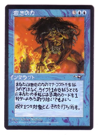
But Duals take quite a while to clear off, the textboxes are hell to over-layer effectively.

Volcanon
Legendary Snooty Caller
Posts: 487
Joined: Wed Feb 22, 2006 5:17 am
Location: Toronto, Canada

Post by Volcanon » Mon Sep 22, 2008 5:59 am

mystical_tutor wrote:
Volcanon wrote:instad of japense, wy not do some other languag elike korean?
Some of you may not be aware that the reason Primal Clay did not come out in Japanese 4th Ed. .
No Japanese mystical clay? Wooooah, then I shouldn't be selling mine for 50 cents then.

User avatar
mystical_tutor
Legendary Old Fart Magic Player
Posts: 3056
Joined: Mon Dec 10, 2007 3:02 am
Location: Colorado Springs

Post by mystical_tutor » Mon Sep 22, 2008 7:28 am

magic-belgium wrote:You were born 28/10/1940 then. Correct ?
Exactly. In fact two years ago I visited Greece on that day and found they had made a national holiday out of it..............
Gary Adkison
Father of a former Wizards of the Coast janitor.

Knowledge is proud because it thinks it knows so much; wisdom is humble because it realizes it knows so little.

User avatar
yawg07
Legendary Chairman of Altered Art
Posts: 650
Joined: Fri Sep 01, 2006 6:20 am

Post by yawg07 » Fri Sep 26, 2008 2:59 am

Well ... I figured it was about time ...

Image

The text isn't perfect, but there is just so damn much of it.
I love it! I'm loving doing this, I can feel myself learning more and more.

My Hymn to Tourach sold for $35 :-O
I guess other people like it very much too!

User avatar
magic-belgium
Librarities Legend
Posts: 1932
Joined: Tue Sep 25, 2007 7:19 am
Location: Belgium

Post by magic-belgium » Fri Sep 26, 2008 6:36 am

Good for you Gus !

Volcanon
Legendary Snooty Caller
Posts: 487
Joined: Wed Feb 22, 2006 5:17 am
Location: Toronto, Canada

Post by Volcanon » Fri Sep 26, 2008 8:34 am

Goes to show people will pay too mcuh for anything


you gotta watch your katakana "ta". right now it's too stylized and looks like "Nu". Also your "n" is looking a lot like "so".

Between "toshi" and "sore wo utikesu" you need a comma, not a period.

Edit: your kanji for "shiharai" looks a bit strange too. the top and bottom halves should be roughly the same size.

User avatar
yawg07
Legendary Chairman of Altered Art
Posts: 650
Joined: Fri Sep 01, 2006 6:20 am

Post by yawg07 » Fri Sep 26, 2008 1:55 pm

Volcanon wrote:Goes to show people will pay too mcuh for anything


you gotta watch your katakana "ta". right now it's too stylized and looks like "Nu". Also your "n" is looking a lot like "so".

Between "toshi" and "sore wo utikesu" you need a comma, not a period.

Edit: your kanji for "shiharai" looks a bit strange too. the top and bottom halves should be roughly the same size.
Thank you. I'm grateful for the feedback.
Now, on the "n". The first stroke, is it more of an - or an ' ? (horizontal or vertical)
Also, that is supposed to be a comma, I just didn't bring it down enough. The periods are the circles :D
You'll have to excuse my Kanji ignorance (I know my kana, but I know very little kanji) which one is that?

User avatar
yawg07
Legendary Chairman of Altered Art
Posts: 650
Joined: Fri Sep 01, 2006 6:20 am

Post by yawg07 » Fri Sep 26, 2008 5:19 pm

Actually I see it now, especially the "n" and "so" deal. Ugh, that looks bad.
Ah well, it is on eBay anyhow. I'll let the masses fight over it, then I'll do better ones soon.

I'm working on cleaning up my Japanese, as it is pretty hard to keep it neat working so damn small.
So, I tried tracing out card boxes onto a card sleeve, then I wrote in them.
Granted, a sharpie can only get so small. The text box characters are fine with it, but the title HAS to be done in a thin brush.
One of the characters is a 22 stroker (maybe 21, I could have miscounted), and another one is pretty complex.
Besides, I have to use a brush for the white in the title anyhow.

Better? I think it looks a lot better, but I have to apply it.
The first few lines are more crisp than the last two.

Image

Post Reply

Who is online

Users browsing this forum: Google [Bot] and 47 guests